Formatting the rows of a histogram
Each histogram is made up of one or more rows. A histogram will contain more than one row if, for example, you drill down into a resource folder, as each resource in the folder will then be displayed in its own row. You can configure the way in which specific rows of a histogram are displayed.
To format a histogram row:
- Click
 in the histogram row you want to configure, or right-click the histogram pane and select Format Histogram. The Format Histogram dialog appears.
 - Click the Row tab.
- Use the options on this tab to configure the way in which the selected row is displayed, as described below.
You can display a legend in the left-hand section of the histogram pane, which acts as a key, indicating the information that is being graphed in the histogram row.
The following illustration includes a legend:
The legend has been omitted from the following illustration:
Select the Legend check box to display a legend to the left of the selected histogram row, or clear the check box to display the histogram row without a legend.
You can display a grid at the bottom of each row that shows the numerical value of each slice in the histogram.
The following illustration includes a data grid:
The data grid has been omitted from the following illustration:
Select the Data-grid check box to display a data grid under the selected histogram row, or clear the check box to display the row without a data grid. If you are displaying a data grid, specify the number of decimal places you want displayed in the grid in the Decimal places in data-grid field.
You can specify whether the values from individual graphs are included in the data grid using the Include in data-grid check box on the Graphs tab of the Histogram Report Properties dialog.
You can display explanatory text to the left of the y-axis, showing which graphs are included in the selected row.
The following illustration includes axis labels:
The axis labels have been omitted from the following illustration:
Select the Axis labels check box to display explanatory text to the left of the y-axis, showing which graphs are included in the selected row, or clear the check box to exclude these labels.
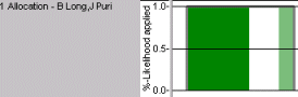
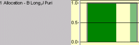
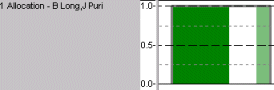
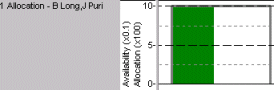
You can apply percentage likelihoods to projects in order to indicate the probability of each project actually going ahead. If you apply percentage likelihoods to a histogram, the effort, quantity, cost and income of the affected projects are adjusted accordingly in the histogram - so if a project is 50% likely to go ahead, its values in the histogram will be reduced by 50%; if you do not, the affected projects are graphed as if they were definitely going ahead. If you have applied percentage likelihoods to projects, you can choose whether to indicate that percentage likelihoods have been applied to the selected row.
The histogram row in the following illustration indicates whether percentage likelihood has been applied to the histogram report:
The histogram row in the following illustration does not indicate whether percentage likelihood has been applied to the histogram report:
Select the % likelihood usage check box to indicate whether percentage likelihood has been applied to the histogram report in the selected row, or clear the check box to exclude this information.
You specify whether percentage likelihood is applied to histogram reports using the Apply % likelihood check box on the Report tab of the Histogram Report Properties dialog.
You can apply a background colour to the selected row if required.
A different background colour has been applied to the histogram row in the following illustration:
The histogram row in the following illustration does not have a different background colour applied:
Select a colour in the Background field if you want to apply a different background colour to the selected row.
You can configure the format of the major and minor ruling lines in the selected row.
Major and minor ruling lines are displayed in the histogram row in the following illustration, each type of line using different formatting:
The histogram row in the following illustration has only major ruling lines displayed, using the default formatting:
Specify the format of the major and minor ruling lines in the Ruling lines fields.
You can apply a specific height to each histogram row if required. You may want to specify a height in this way rather than dragging the boundaries of the histogram row in order to display each row using precisely the same height.
Enter a specific height if required in the Histogram height field.
You can specify a fixed range to the y-axis of a histogram row if required. For example, if the values in a histogram go up to 100,000, you could limit the y-axis range from 0 to 100, in which case the histogram values would be described as 'x 1000' in the axis and legend. Limiting the y-axis in this way often results in a neater histogram when larger figures are involved.
Select a y-axis range (which must include zero) if required in the Fixed y-axis range fields.
When you limit the y-axis, a suitable scale multiplier is chosen automatically for you if you select the Automatic radio button against the Scale multiplier field on the Graphs tab of the Histogram Report Properties dialog - for example, 'x 1000' or 'x 100'. However, you can select a fixed scale multiplier for each graph if you wish, by selecting the Fixed radio button on this tab.
The scale multiplier applied to each graph is displayed in the axis label where necessary, as illustrated in the following example:
You can specify whether the values in the selected row should span across non-working periods such as weekends, or return to zero during non-working periods.
The values in the following illustration span across non-working periods:
The values in the following illustration return to zero during non-working periods:
Select the Draw through non-working check box if you want the values in the selected row to span across non-working periods such as weekends, or clear the check box if you want the values to return to zero during non-working periods.
If you are displaying values for more than one resource or cost centre in the selected row and you are not using the resource or cost centre appearance in the graphs, you can specify whether the values for each resource or cost centre are displayed using a different shade of the selected graph colour. Using a different shade for each resource or cost centre makes the graphs more readable.
A different shade of the graph colour has been used for each resource in the following illustration:
Both resources use the same shade of the graph colour in the following illustration:
Select the Fade colours for multiple resources check box to display different shades of the selected graph colour for each resource or cost centre, making the graphs more readable, or clear the check box to use the same colour for all resources or cost centres in each graph.
You can specify the way in which graphs are stacked in the selected histogram row. Stacking - ie drawing graphs in such a way that they do not obscure each other - can be useful in histograms in which you are displaying more than one graph, or graphing more than one resource or cost centre.
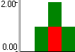
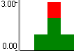
When graphs are not stacked, each graph is drawn from 0 on the vertical scale and one graph may obscure another by being drawn in front of it; when graphs are stacked, each graph is drawn on top of another. Stacking graphs prevents graphs from obscuring one another. This is illustrated below, where a histogram displays two graphs: one shows allocation in green and the other shows over allocation in red:
|
|
|
|
With no stacking, the over allocation graph partially obscures the allocation graph as it is drawn in front of it |
With stacking, the over allocation graph is drawn on top of the allocation graph, so the graphs do not obscure each other |
Specify the way in which you want the graphs to be stacked in the selected row in the Stacking field (in order to display graphs stacked on top of one another, you must also select the Allow stacking check box on the Graphs tab of the Histogram Report Properties dialog).
Select:
- No Stacking to display the graphs without stacking, where one may obscure another. If you use this stacking option when more than one graph is displayed in a row, it is a good idea to display the data grid underneath the row to show totals for each resource or cost centre, making the data easier to interpret.
- Stack All to stack all graphs in the histogram on top of one another, so all graphs relating to all resources or cost centres are always visible. This stacking option could be used, for example, when displaying allocation graphs in order to find out the total number of resources at work on a project at any one time in order to calculate how many people you will need to cater for on site.
- Stack Graphs for each Resource to stack the graphs included in the histogram on top of one another, but not stack the resources or cost centres you are graphing. All graphs relating to one resource or cost centre are always visible, but one resource or cost centre's graphs may obscure those of other resources or cost centres. This stacking option could be used, for example, when displaying capped allocation and over allocation graphs for resources, in order to find out when resources are over-assigned. It is a good idea to display the data grid underneath the row to show totals for each resource or cost centre, making the data easier to interpret.
- Stack Resources for each Graph to stack the resources or cost centres you are graphing on top of one another, but not stack the graphs included in the histogram. One graph relating to all resources or cost centres is always visible, but one graph may obscure other graphs.
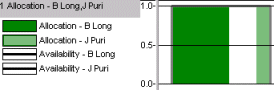
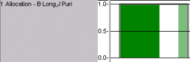
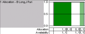
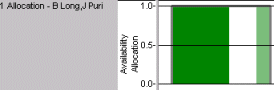
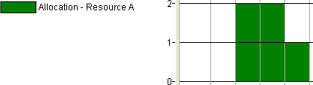
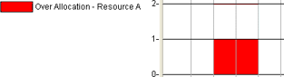
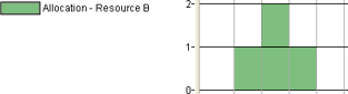
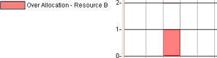
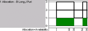
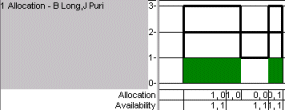
These various options are illustrated below, using graphs that show the allocation and over allocation of two resources, A and B. Resources A and B both have an availability of 1 and both are over allocated. This can be illustrated in four individual graphs:
In the following two illustrations, graphs showing the allocation of both resources are displayed in the same histogram, first without stacking and then with stacking.
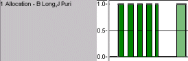
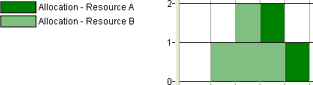
No Stacking: resource B's allocation is drawn in front of resource A's allocation, partially obscuring it:
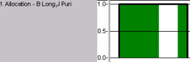
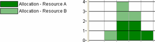
Stack All: resource B's allocation is drawn on top of resource A's allocation, so neither graph obscures the other. Note also how the scale on the left changes as a result of stacking, as the two graphs are drawn on top of each other:
In the following illustrations, the allocation and over allocation of both resources is displayed in the same histogram, with various stacking options.
No Stacking: all of the graphs are drawn in front of or behind each other, resulting in some graphs being either completely or partially obscured.
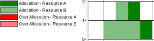
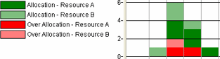
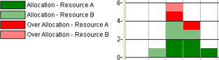
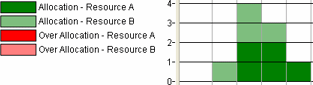
With the allocation graph in the foreground this appears as follows, with the over allocation graph completely obscured and resource B's allocation drawn in front of resource A's allocation, partially obscuring it:
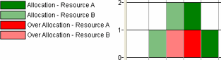
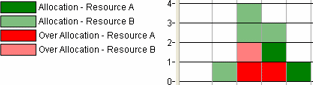
With the over allocation graph in the foreground this appears as follows, with the allocation graph partially obscured by the over allocation graph and the over allocation of resource A partially obscured by the over allocation of resource B:
Stack All: the graphs showing the allocation and over allocation of both resources are all visible, with no graph obscured by another.
With the allocation graph in the foreground this appears as follows, with the allocation graphs drawn at the top of the stack:
With the over allocation graph in the foreground this appears as follows, with the over allocation graphs drawn at the top of the stack:
Stack Graphs for each Resource: the allocation and over allocation graphs are stacked for both resources, so one resource's allocation and over allocation is always visible. However, the graphs relating to resource B partially obscure the graphs relating to resource A.
With the allocation graph in the foreground this appears as follows, with the allocation graphs drawn at the top of the stack:
With the over allocation graph in the foreground this appears as follows, with the over allocation graphs drawn at the top of the stack:
Stack Resources for each Graph: the graphs relating to both resources are stacked, so either the allocation or the over allocation of both resources is always visible. However, the allocation graphs may partially or completely obscure the over allocation graphs, or vice-versa.
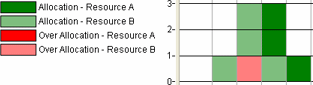
With the allocation graph in the foreground this appears as follows, with the allocation of both resources visible but with the over allocation graph completely obscured:
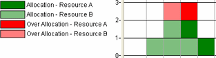
With the over allocation graph in the foreground this appears as follows, with the over allocation of both resources visible but with the allocation graph partially obscured:
If you are displaying values for more than one resource or cost centre in the selected row and are stacking graphs, the data grid at the bottom of the row normally displays a value for each resource or cost centre. You can choose to sum these values into a single value, representing all resources or cost centres.
The values in the data grid are summed in the following illustration:
The values in the data grid are not summed in the following illustration:
Select the Sum values in data-grid check box to sum the data grid values into a single value, or clear the check box to display separate values.
Changing the resources or cost centres being graphed in a histogram
Changing the histogram report in a histogram
Formatting the text and background of a histogram
Configuring the way in which graphs are displayed