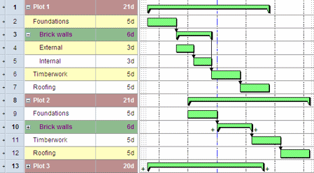
Highlighting bars that indicate the project hierarchy
You can highlight the bars that indicate the project hierarchy - ie those on which
You can specify a different appearance for each level of the project hierarchy. For example, if the project hierarchy of
To specify appearance settings for the project hierarchy:
- On the Format tab, in the Format group, click Hierarchy Appearance; alternatively, right-click a
Each row in the grid on this dialog represents a level of the project hierarchy. For example, the appearance settings you define for the first row apply to the top level of the project hierarchy, the settings you define for the second row apply to the second level of the project hierarchy, and so on. - Click Add to a new row to the grid.
- Click in each column of the grid to specify the font colour, background colour and font settings to apply to bars that indicate the project hierarchy at that level.
- Click OK to close the dialog and apply the changes.
You can specify whether these hierarchy appearance settings apply to:
- The spreadsheet.
- The bar chart.
- Both spreadsheet and bar chart.
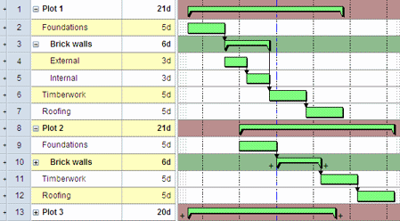
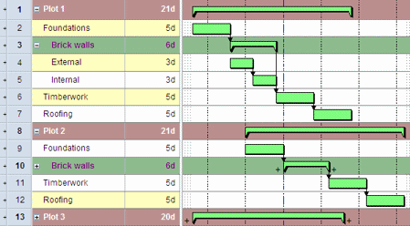
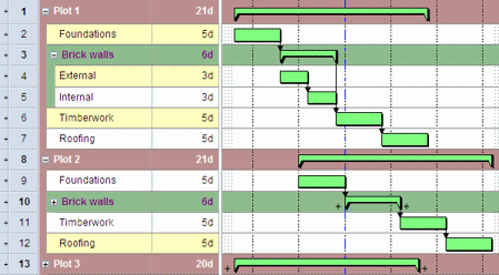
If you apply hierarchy appearance settings to the spreadsheet, you can also specify that the hierarchical appearance colouring should continue vertically down the far left hand side of the spreadsheet. This is known as 'banding'. Displaying vertical hierarchy banding in views that display tasks in a nested hierarchy makes it easier to identify the levels within the hierarchy to which tasks belong.
To specify the way in which the hierarchical appearance settings are applied:
- On the Format tab, in the Format group, click Format Bar Chart. The Format Bar Chart dialog appears.
- Click the General tab.
- Select the Use summary row colouring on spreadsheet check box to apply the appearance settings to the spreadsheet and select the Use summary row colouring on bar chart check box to apply them to the bar chart. Note that the settings you apply take precedence over any other colouring or font settings that have been applied to spreadsheet cells.
- If you have selected the Use summary row colouring on spreadsheet check box, select the Display hierarchy banding when not sorting check box if you want the hierarchical appearance colouring to continue vertically down the far left hand side of the spreadsheet, or clear the check box to restrict this colouring to the horizontal bars themselves.
- If you click the globe icon in the project view when vertical hierarchy banding is displayed, the banding disappears from the view. This is because clicking the globe icon displays a view in which the project hierarchy is flattened. The vertical hierarchy banding is redisplayed when you click a
- If you override the background colour of the left-most column in the spreadsheet when vertical hierarchy banding is displayed, you may notice odd effects in which the override colour is not displayed at the far left of the column in some bars. For this reason, we recommend that you do not override the background colour of the left-most column in the spreadsheet when vertical hierarchy banding is displayed.