Editing histogram report options
Note that as a histogram report can be used by more than one histogram, the changes you make to a histogram report are reflected in all histograms that use the histogram report.
To edit histogram report options:
- Click
 on the Histogram toolbar, or right-click the histogram pane and select Histogram Report Properties. The Histogram Report Properties dialog is displayed.
 - Click the Report tab.
- Use the options on this tab to configure the way in which the histogram report displays information, as described below.
Enter the name of the histogram report in the Name field.
If resources have more than one role, or skill, in a project, you can choose the roles in which to graph them using the Resource field:
- Select Resource (All Skills) to graph allocations of the selected resource in all of the resource's skills. For example, if you graph the allocations of a resource in the Plasterer folder and the resource is also a painter, all of the resource's allocations as a plasterer and all of their allocations as a painter will be included in the histogram report.
- Select Resource and Sub-Resources if you are planning to graph allocations of a resource folder and of all of the resources within the folder, and you also want to graph any allocations of the resources in the folder that relate to the resources' other skills. For example, if you graph the allocations of the resources in the Plasterer folder and one of the resources in the folder is also a painter, all of the allocations of the plasterer resources and all of the multi-skilled resource's allocations as a painter will be included in the histogram report.
- Select Skill to graph allocations of the selected resource in the selected skill only. For example, if you graph the allocations of a resource in the Plasterer folder and the resource is also a painter, all of the resource's allocations as a plasterer will be included in the histogram report, but all of their allocations as a painter will be excluded.
- Select Skill and Sub-Skills if you are planning to graph allocations of a resource folder and all of the resources within the resource folder, and you want to exclude any allocations of the resources in the folder that relate to the resources' other skills. For example, if you graph the allocations of the resources in the Plasterer folder and one of the resources in the folder is also a painter, all of the allocations of the plasterer resources will be included in the histogram report, but all of the multi-skilled resource's allocations as a painter will be excluded.
If the histogram report includes a graph that details the availability of resources, specify the way in which the availability of the selected resource should be calculated in the Availability field:
- Select Resource (All Skills) to specify that the resource's availability should be the sum of their availability in each of their different skills. For example, if you graph the availability of a resource in the Plasterer folder and the resource is also a painter, the resource's availability will be the sum of their availability as a plasterer and their availability as a painter. If you select this option when graphing the availability of a resource folder, the availability will be that of the folder itself, disregarding the availability of any of the resources within the folder.
- Select Resource and Sub-Resources if you are planning to graph the availability of a resource folder to specify that the resource's availability should be the sum of the availability of the resource folder itself, the availability of the individual resources within the folder and any availability of the resources in the folder that relates to the resources' other skills. For example, if you graph the availability of the resources in the Plasterer folder and one of the resources in the folder is also a painter, the availability will be the sum of the availability of the folder itself, the availability of the resources within the folder and the availability of the multi-skilled resource as a painter.
- Select Skill to specify that the resource's availability should be the availability of the resource in the selected skill only. For example, if you graph the availability of a resource in the Plasterer folder and the resource is also a painter, the resource's availability will be their availability as a plasterer only, disregarding the availability of the multi-skilled resource as a painter. If you select this option when graphing the availability of a resource folder, the availability will be that of the folder itself, disregarding the availability of any of the resources within the folder.
- Select Skill and Sub-Skills if you are planning to graph the availability of a resource folder to specify that the resource's availability should be the sum of the availability of the resource folder itself and the availability of the individual resources within the folder, disregarding any availability of the resources in the folder that relates to the resources' other skills. For example, if you graph the availability of the resources in the Plasterer folder and one of the resources in the folder is also a painter, the availability will be the sum of the availability of the folder itself and the availability of the resources within the folder, disregarding the availability of the multi-skilled resource as a painter.
You can limit a histogram report to a range of dates if required. If you do not specify a date range, the histogram report covers the duration spanned by the scope you specify on the Graphs tab of this dialog. If you specify a date range, all tasks and allocations that fall outside the range are excluded.
Enter a range of dates in the Date range fields if you want to limit the histogram report to a range of dates. You can enter dates into both fields, or into just one of the fields.
Select the time unit over which you want graph values to be averaged in the Period field. The larger the time unit you select, the less detailed the histogram report will be. For example, averaging values over a month will give less precise details than averaging over a day, as illustrated below:
|
|
|
|
Time slice of months |
Time slice of weeks |
The graphs in the histogram report will probably be displayed differently depending on which slicing unit you select. Set the slicing time unit to None if you do not want the resource graph values to be averaged over time periods. The graph values are then displayed during the resource's working periods.
Specify whether you want to display average values, maximum values, minimum values, difference values or mean values within each slicing unit in the Type field.
Note that the slicing types that appear in this field depend on whether the Show common histogram slice options only check box is selected on the General tab of the Options dialog. If this check box is selected, only the most commonly-used slicing types will be available; if the check box is cleared, all slicing types will be available.
The length of an working period can differ between calendars: for example, a working day could be 6.5 hours long in one calendar and 8 hours long in another. If you select a working time unit in the Period field, select the calendar that defines the length of the working time unit in the Calendar field.
Examples of slicing types
The following explanations of slicing types refer to two types of graph:
- Non-cumulative graphs - these graphs show the values that are present in each successive time period; each time period's values are totally unrelated to either predecessor or successor time period's values. An example of a non-cumulative graph is the 'allocation' graph:
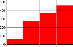
- Cumulative graphs - these graphs show accrued values, such that each time period's value is the result of adding what occurred in that time period to the accrued value of all the preceding time periods. An example of a cumulative graph is the 'cost to date' graph, where the graph gradually increases over time:
The following explanations are accompanied by a number of illustrations, showing the effect of using each slicing type. The illustrations are based on the following graphs, which are shown below unsliced.
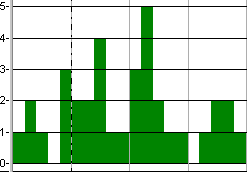
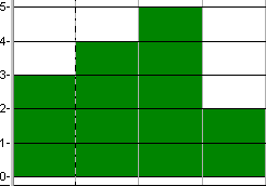
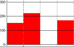
The following non-sliced graph shows the allocation of a resource over a four-week period:
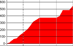
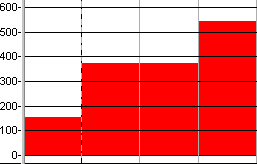
The following non-sliced graph shows the cost to date of a project over a four-week period:
Average
Use this slicing type if you want to graph the average values within each slicing period - for example, if you want to graph the average allocation of a resource each week.
- For non-cumulative graphs, this slicing type uses an average of the values in the current time period.
- For cumulative graphs, this slicing type displays a 'sawtooth'-style graph, using the average of the values in the current time period.
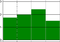
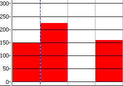
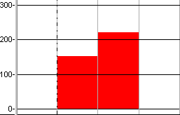
In the illustration below, the allocation graph has been given a slicing period of Weeks and a slicing type of Average. The graph therefore displays the average value for each week. In week 2, for example, the allocation values in the non-sliced graph were 2, 2, 4, 1 and 1, totalling 10. This has been divided by the number of days to arrive at the average figure (10 / 5 = 2):
In the illustration below, the cost to date graph has been given a slicing period of Weeks and a slicing type of Average. The graph therefore displays the average value for each week, in a 'sawtooth'-style:
Bar Average
Gives the same results as 'Average', but for cumulative graphs, this slicing type displays a bar graph, rather than a 'sawtooth'-style graph.
In the illustration below, the allocation graph has been given a slicing period of Weeks and a slicing type of Bar Average. The graph therefore displays the average value for each week, giving the same results as the Average slicing type:
In the illustration below, the cost to date graph has been given a slicing period of Weeks and a slicing type of Bar Average. The graph therefore displays the average value for each week, in bar graph style:
Bar Difference
Use this slicing type if you want to graph the difference between the values at the end of each slicing period and the values at the start of each slicing period - for example, if you want to graph the amount of unallocated effort over a set period of time.
For both non-cumulative and cumulative graphs, this slicing type uses the difference between the values at the end of each slicing period and the values at the start of each slicing period.
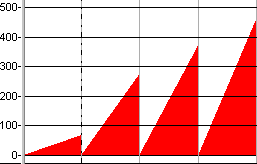
In the illustration below, the allocation graph has been given a slicing period of Weeks and a slicing type of Bar Difference. The graph therefore displays the difference between the end and start values for each week:
In the illustration below, the cost to date graph has been given a slicing period of Weeks and a slicing type of Bar Difference. The graph therefore displays the difference between the end and start values for each week:
Bar Maximum
Use this slicing type if you want to graph the maximum values within each slicing period - for example, if you want to graph the maximum allocation of a resource each week.
- For non-cumulative graphs, this slicing type uses the maximum value in the current time period.
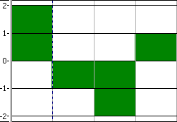
- For cumulative graphs, this slicing type uses the maximum value in the current time period minus the maximum value in the previous time period, thus giving a non-cumulative maximum value. The value returned using this slicing type is positive if the values in the cumulative graph are increasing during the start and end of the time period, and negative if the values are decreasing during the start and end of the time period.
In the illustration below, the allocation graph has been given a slicing period of Weeks and a slicing type of Bar Maximum. The graph therefore displays the maximum value for each week. In week 2, for example, the allocation values in the non-sliced graph were 2, 2, 4, 1 and 1. The maximum value was 4, which is used as the second week's value:
In the illustration below, the cost to date graph has been given a slicing period of Weeks and a slicing type of Bar Maximum. For each week, the graph therefore displays the maximum value in the week minus the maximum value in the previous week, resulting in a non-cumulative graph in which maximum figures for each week are easily identified:
Bar Maximum Cumulative
Gives the same results as 'Bar Maximum', but for cumulative graphs, this slicing type simply uses the maximum value in the current time period, thus giving a cumulative maximum value.
In the illustration below, the allocation graph has been given a slicing period of Weeks and a slicing type of Bar Maximum Cumulative. The graph therefore displays the maximum value for each week, giving the same results as the Bar Maximum slicing type:
In the illustration below, the cost to date graph has been given a slicing period of Weeks and a slicing type of Bar Maximum Cumulative. For each week, the graph therefore displays the maximum value in the week, resulting in a cumulative graph:
Bar Minimum
Use this slicing type if you want to graph the minimum values within each time period - for example, if you want to graph the minimum allocation of a resource each week.
- For non-cumulative graphs, this slicing type uses the minimum value in the current time period.
- For cumulative graphs, this slicing type uses the minimum value in the current time period minus the minimum value in the previous time period, thus giving a non-cumulative minimum value. The value returned using this slicing type is positive if the values in the cumulative graph are increasing during the start and end of the time period, and negative if the values are decreasing during the start and end of the time period.
In the illustration below, the allocation graph has been given a slicing period of Weeks and a slicing type of Bar Minimum. The graph therefore displays the minimum value for each week. In week 2, for example, the allocation values in the non-sliced graph were 2, 2, 4, 1 and 1. The minimum value was 1, which is used as the second week's value:
In the illustration below, the cost to date graph has been given a slicing period of Weeks and a slicing type of Bar Minimum. For each week, the graph therefore displays the minimum value in the week minus the minimum value in the previous week, resulting in a non-cumulative graph in which minimum figures for each week are easily identified:
Bar Minimum Cumulative
Gives the same results as 'Bar Minimum', but for cumulative graphs, this slicing type simply uses the minimum value in the current time period, thus giving a cumulative minimum value.
In the illustration below, the allocation graph has been given a slicing period of Weeks and a slicing type of Bar Minimum Cumulative. The graph therefore displays the minimum value for each week, giving the same results as the Bar Minimum slicing type:
In the illustration below, the cost to date graph has been given a slicing period of Weeks and a slicing type of Bar Minimum Cumulative. For each week, the graph therefore displays the minimum value in the week, resulting in a cumulative graph:
Mean
Use this slicing type if you want to graph the average values within each time period - for example, if you want to graph the average allocation of a resource each week - and you want the average value to be calculated over the entire time period, not just the working time within the time period.
An example of where this slicing type might come in useful is if you want to graph the weekly cost of a resource that you are hiring for a period of time - for example, a piece of machinery. You would want the average value to be calculated over the entire time period rather than the working time within the period, as you are having to hire the resource for the entire time period, even if it is only being used during the working time.
- For non-cumulative graphs, this slicing type uses the same values as 'Average' when used with a working slicing time unit. The values differ when this slicing type is used with an elapsed time unit, as it averages values over the entire elapsed unit, rather than just the working time within the unit.
- For cumulative graphs, this slicing type gives the same results as 'Average'.
In the illustration below, the allocation graph has been given a slicing period of Elapsed Weeks and a slicing type of Mean. The graph therefore displays the average value for each week, calculated over the entire week, not just the working time within the week. Note how the values differ from the non-cumulative graph illustration of the Average slicing type:
In the illustration below, the cost to date graph has been given a slicing period of Weeks and a slicing type of Average. The graph therefore displays the average value for each week, in a 'sawtooth'-style, giving the same results as the Average slicing type:
Bar Mean
Gives the same results as 'Mean', but for cumulative graphs, this slicing type displays a bar graph, rather than a 'sawtooth'-style graph.
In the illustration below, the allocation graph has been given a slicing period of Elapsed Weeks and a slicing type of Mean. The graph therefore displays the average value for each week, calculated over the entire week, not just the working time within the week. Note how the values differ from the non-cumulative graph illustration of the Bar Average slicing type:
In the illustration below, the cost to date graph has been given a slicing period of Elapsed Weeks and a slicing type of Bar Mean. The graph therefore displays the average value for each week, in bar graph style, giving the same results as the Bar Average slicing type:
Select the time unit over which you want graph values to be averaged when you copy information from the histogram to the clipboard in the Clipboard unit field. This field has no effect if a time unit for slicing is selected in the Period field.
You can apply percentage likelihoods to projects in order to indicate the probability of each project actually going ahead. If you have applied percentage likelihoods to projects, select the Apply % likelihood check box to apply the recorded percentage likelihoods to the histogram report.
If you apply percentage likelihoods to a histogram report, the effort, quantity, cost and income of the affected projects are adjusted accordingly in the histogram - so if a project is 50% likely to go ahead, its values in the histogram will be reduced by 50%; if you do not, the affected projects are graphed as if they were definitely going ahead. You can specify whether to indicate that percentage likelihoods have been applied to the values in a histogram using the Row tab of the Format Histogram dialog.
You can specify which allocations are included when using an allocation-based filter in conjunction with a histogram, using the Filter individual allocations check box. If you select this check box, the histogram only includes information from allocations that meet the criteria of whichever allocation-based filter has been selected in the Filter field, on the Graphs tab of the Histogram Report Properties dialog. If you clear this check box, information from allocations that do not meet the filter criteria, but that are assigned to tasks with allocations that do meet the filter criteria, are also included in the histogram.
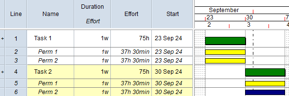
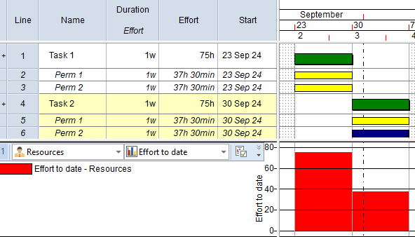
To illustrate this, the following view contains two tasks:
- 'Task 1', which has two permanent resource allocations to which a 'Yellow' code has been assigned. Each allocation has 37h 30m effort.
- 'Task 2', which has one permanent resource allocation to which the 'Yellow' code has been assigned, and one permanent resource allocation to which a 'Blue' code has been assigned. Each allocation has 37h 30m effort.
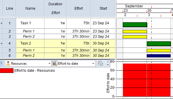
A histogram graphs effort from the permanent resource allocations in the view. A permanent resource allocation filter has been applied to the graph (but not to the view), which filters for permanent allocations with a 'Yellow' code assigned to them.
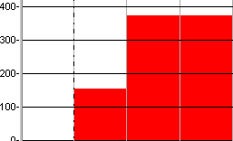
With the Filter individual allocations check box cleared, the histogram includes information from both the permanent resource allocations on Task 1, as the 'Yellow' code has been assigned to both allocations. The histogram also includes information from both the permanent resource allocations on Task 2, even though the 'Yellow' code has only been assigned to one of the allocations. Because the 'Yellow' code has been assigned to one of Task 2's allocations, information from all of Task 2's allocations is included in the histogram:
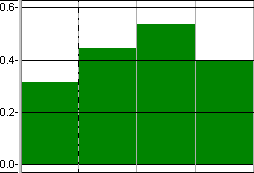
With the Filter individual allocations check box selected, the histogram only includes information from one of the permanent resource allocations on Task 2 - the one to which the 'Yellow' code has been assigned. Information from any of Task 2's allocations that do not meet the filter criteria is excluded:
Although the example above uses permanent resource allocations, the new check box also applies to histograms that graph consumable allocation and cost allocation information, and to which a consumable resource allocation filter or a cost allocation filter has been applied.
You may find it helpful to use this new check box in conjunction with the Show only relevant allocations check box, on the Filter Properties dialog, which you can use to omit all allocations that do not meet the filter criteria from the bar chart in a filtered view.
The Filter individual allocations check box works with the following types of filter:
- Any filter where the objects being filtered are set to Permanent resource allocations, Consumable resource allocations or Cost allocations on the Tasks and Allocations page of the Filter Wizard.
- Any RBS/CBS filter - ie a filter that was created when an RBS/CBS view was active.
- Any filter where the objects being filtered are set to All task and allocation types on the Tasks and Allocations page of the Filter Wizard, provided that only the following pages of the Filter Wizard are used:
- Calendar.
- Costs.
- Duration.
- Progress.
- Resources - Consumable.
- Resources - Permanent.
- Time Slice - Date Range.
- User Fields.
- User Tables.